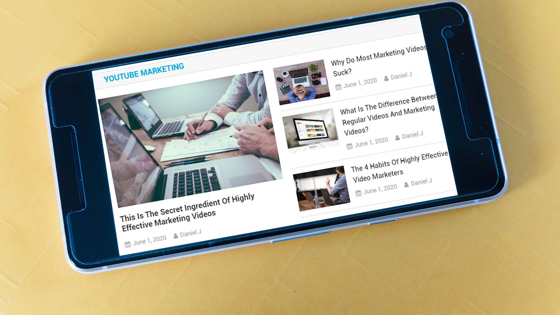
One of the fastest-growing segments of internet use is mobile. Devices like the iPhone and Blackberry are able to access the web from almost anywhere, and they are selling like crazy. And that means you need to be sure that your website works on these devices. In this article, we’re going to look at several reasons that this is so important.
Mobile devices like the iPhone have very capable web browsers that are able to display pretty well any standard website. But there’s still one big stumbling block when it comes to using those sites – the size of the screen.
When a standard web page is shrunk down to fit on these small screens, it makes it practically impossible to read and very difficult to click on any links. Yes, you can zoom in and pan around the page, but it adds a level of complexity to the process.
If your web page is optimized for these small screens, on the other hand, it makes it far easier to use. And let’s face it – if your website is not easy to use, your visitors are probably going to just leave and find one that is.
In addition to having a mobile-friendly layout, you should also keep in mind how people tend to use these devices to access the internet.
The majority of people who are looking at your website on a mobile device are looking for very specific information:
– Your phone number
– Your address
– Hours of operation
– etc.
Ideally, you want to make this information as easy to find as possible. Your mobile layout should highlight these things in such a way that they’re either immediately visible when someone visits your site, or they’re no more than one click away.
Creating a mobile version of your website doesn’t require two completely separate domains, either. When someone visits your site, the type of browser and device they’re using is sent to your site, so you can simply display whichever version of the site is appropriate.
If a web design company handles your website for you, they should be able to set this up for you. It’s simply a matter of having them design a mobile-friendly version of what you already have, and identifying the information that you want to have included on the mobile version of your site.


