
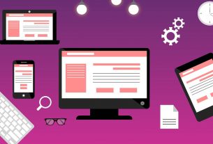
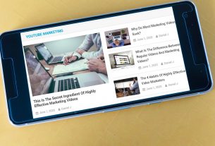
The fact is that mobile devices are what people are using. So if you want people to consume your content, you need to ensure that it works on mobile as well as it works on a PC. This is especially true if you want your infographics to be shared on social media.
Limit the Length – Instead of making your infographics super-long, make them a little shorter and compact so that they fit on one average mobile device screen in the first place. That way everyone can look at it on their screens.
Create Thumbnails – Thumbnails of the infographic will help with mobile because it shows a smaller version of the infographic that can be clicked on to go to the landing page where the infographic resides.
Create Smaller Infographics – Instead of making super-big and long infographics, consider making “meme-sized” infographics that explain one point at a glance. These are perfect for sharing on social media.
Create Simple Layouts – Don’t try to be too elaborate with your infographics that you want to be shared on social media. Instead, make them simple, converting just one topic so that it’s easier to create without a lot of space.
Give Your File an SEO-Rich Name – Name the file something that tells the search engines and users what it is. Don’t give it a generic name. If the infographic is about how to make ten outfits from the same three pieces of clothing, then say so.
Put Your Infographic on a Landing Page – One way to ensure that your infographic not only is shared across all social networks but also brings links to your website is to create a landing page just for the infographic so that it has a home on your site.
Create Interactive Infographics – Use HTML, CSS3, media queries, and any other friendly interactive coding to help the design display according to the device correctly. If you create a dynamic infographic, it’ll work anyplace.
Know the Most Frequent Resolution for Platforms – That way you can design the responsive design to display the right resolution for various platforms, in the way that your audience wants to look at them.
Use Flexible Layout – You can use flexible grids to organize content so that it can be changed and displayed differently but still understandably on mobile. If you use relative width instead of fixed width, your infographics will look better on mobile.
Understand and Define Breakpoints – If you understand the breakpoints most systems have, you can design with that in mind, which will help your images look better. Target smartphone portrait mode, and use the right code to display for the right size of the devices.
Infographics are an amazing way to give your audience information in bite-sized pieces that are easier to understand, due to the visual nature of an infographic. But, they will be shared most often on social media, and you, therefore, need to understand how each platform will view your infographic and how your audience likes to access your content. You can then design a responsive infographic that gets shared more and is understood well by your audience.